- Explaining Standard Deviation
- Are the Skewness and Kurtosis Useful Statistics?
- Normal distribution
- Histograms
- 5. Anderson-Darling Test for Normality
- Hypothesis Testing
- THE PROBLEM
- A BRIEF PAUSE FOR THE STANDARD NORMAL DISTRIBUTION
- STEP 1: FORMULATE THE NULL HYPOTHESIS AND ALTERNATIVE HYPOTHESIS
- STEP 2: DETERMINE THE SIGNIFICANCE LEVEL YOU WANT
- STEP 3: COLLECT THE DATA AND CALCULATE THE SAMPLE STATISTICS
- STEP 4: CALCULATE THE P VALUE
- STEP 5: COMPARE THE P VALUE TO THE DESIRED SIGNIFICANCE LEVEL
- SUMMARY
Explaining Standard Deviation
Have you ever had to explain to anyone what a standard deviation is? Or perhaps, you aren’t sure yourself what it is. What is it used for? Why is it important in process improvement? When using control charts, the standard deviation, as well as the average, is a very important parameter. One must understand what is meant by the standard deviation. This newsletter addresses this. We will start with describing what an average is.
AVERAGE
The average (also called the mean) is probably well understood by most. It represents a “typical” value. For example, the average temperature for the day based on the past is often given on weather reports. It represents a typical temperature for the time of year.
The average is calculated by adding up the results you have and dividing by the number of results. For example, suppose we have wire cable that is cut to different lengths for a customer. These lengths, in feet, are 5, 6, 2, 3, and 8. The average is determined by adding up these five numbers and dividing by 5. In this case, the average (X) is:
X = (5+6+2+3+8)/5 = 4.8
The average length of wire for these five pieces is 4.8 feet.
STANDARD DEVIATION
While the average is understood by most, the standard deviation is understood by few. To begin to understand what a standard deviation is, consider the two histograms. Histogram 1 has more variation than Histogram 2.
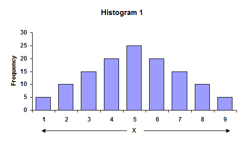
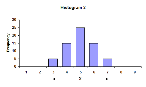
In the first histogram, the largest value is 9, while the smallest value is 1. The overall range of data is 9 - 1 = 8. In the second histogram, the overall range is 7 - 3 = 4. The range is larger for Histogram 1. Ranges are often used in control charts for variation (for example, the X-R charts). In fact, the average range from a control chart can be used to calculate the process standard deviation.
The average of the data in each histogram is 5. So, in this case, the highest bar is the average. We can also see that Histogram 1 has more variation than Histogram 2 because the distance, on average, of the individual observations from the overall average (5) is greater in Histogram 1 than Histogram 2. This distance is usually referred to as a deviation. If your have a result X = 3, the deviation of this value from the average is 3 - 5 = - 2 or the value “3” is two units below the average.
One can view the standard deviation as being an “average” distance each individual measurement is from the average, X. Let’s return to the numbers we found the average for earlier to see how we can estimate this average deviation from X. These numbers were the length of wire cable we had cut. We want to find the average distance each number is from X = 4.8. To do this, we can determine the deviation of each number from the average as shown below.
| Length (X) | Deviation from Average (X- X) |
|---|---|
| 5 | 5 - 4.8 = 0.2 |
| 6 | 6 - 4.8 = 1.2 |
| 2 | 2 - 4.8 = -2.8 |
| 3 | 3 - 4.8 = -1.8 |
| 8 | 8 - 4.8 = 3.2 |
If we add up the deviations from average, we discover that:
Sum of the deviations from average = 0.2 + 1.2 + (- 2.8) + (-1.8) + 3.2 = 0
The sum of the deviations from average added up to zero! This is not a coincidence. The fact is that when the deviations from the average are added up, the sum will always be zero if the average was calculated from the data. We cannot use this method to determine the standard deviation. The negative signs in the sum of deviations are what cause the sum to be zero. Suppose instead that we square each deviation from the average (i.e., multiply the deviation by itself). Squaring a negative number makes it positive. In this case the square of the deviations are:
| Length (X) | Square of Deviation from Average (X-X)2 |
|---|---|
| 5 | (5 - 4.8)2 = (0.2)2 = .04 |
| 6 | (6 - 4.8)2 = (1.2)2 = 1.44 |
| 2 | (2 - 4.8)2 = (-2.8)2 = 7.84 |
| 3 | (3 - 4.8)2 = (-1.8)2 = 3.24 |
| 8 | (8 - 4.8)2 = (3.2)2 = 10.24 |
MORE ON STANDARD DEVIATION
The sum of these squares of deviations from the average is 22.8. This number can now be used to determine the “average” distance each individual result is from X. The temptation here is to divide by n = 5 since there are five lengths. Unfortunately, this would be incorrect. The reason is that we would actually be underestimating the true standard deviation. This is primarily because we used the data to calculate an average (we don’t know the true average of the process). This means that there are only n-1 independent pieces of information. If we know the average and four of the individual results, the fifth result can be determined. Thus, the correct number to divide by is n - 1 = 4.
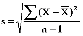
Thus, the sum of the squares of the deviation from the average divided by 4 is 22.8/4 = 5.7. Remember, this number contains the squares of the deviations. To get to the standard deviation, we must take the square root of that number. Thus, the standard deviation is square root of 5.7 = 2.4.
The equation for a sample standard deviation we just calculated is shown in the figure. Control charts are used to estimate what the process standard deviation is. For example, the average range on the X-R chart can be used to estimate the standard deviation using the equation s = R/d2 where d2 is a control chart constant (see March 2005 newsletter).
USE OF STANDARD DEVIATION
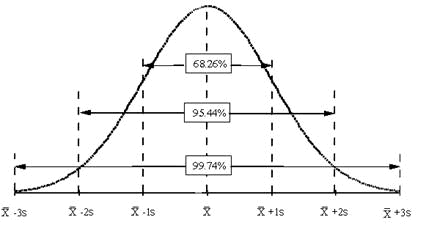
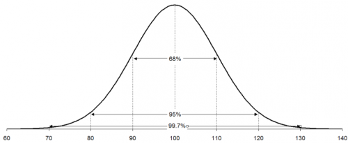
So, why are the standard deviation and, for that matter, the average important? There are many types of control charts that are based on variables data. The basic probability distribution that governs the calculation of the control limits on these charts is the normal distribution. The normal distribution is the familiar bell shaped curve shown in the above figure.
The normal distribution has several interesting characteristics. The shape of the distribution is determined by the average, X, and the standard deviation, s. The highest point on the curve is the average. The distribution is symmetrical about the average. Most of the area under the curve (99.7%) lies between -3s and +3s of the average. In addition, about 95.44% of the curve is between -2s and +2s of the average, while 68.26% of the curve is between -1s and +1s of the average.
To determine if a normal distribution exists, you can make a histogram of the individual results. If this histogram is bell-shaped, you can assume that the individual measurements are normally distributed. For example, suppose you are monitoring how long it takes to approve or disapprove a credit application for a customer. From your control charts (assume the process is in control), you have estimated the process average to be 14 working days and the standard deviation to be 2 days. After constructing a histogram on the days to approve or disapprove a credit application, you discover that it is bell-shaped. You can now replace the histogram with the normal distribution shown in the figure below.
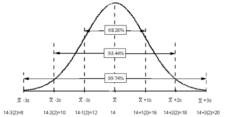
Since the process is in statistical control, you know that about 67% of the time, it will take 12 to 16 days to process a credit application; 95% of the time it will take 10 to 18 days; and 99.7% of the time it will take 8 to 20 days. So, the average and standard deviation (for a normal distribution) allow you to begin to consider process capability. Can the process meet our customer specifications? Take a look at our three part newsletter on process capability.
Are the Skewness and Kurtosis Useful Statistics?
You have a set of samples. Maybe you took 15 samples from a batch of finished product and measured those samples for density. Now you are armed with data you can analyze. And your software package has a feature that will generate the descriptive statistics for these data. You enter the data into your software package and run the descriptive statistics. You get a lot of numbers – the sample size, average, standard deviation, range, maximum, minimum and a host of other numbers. You spy two numbers: the skewness and kurtosis. What do these two statistics tell you about your sample?
This month’s publication covers the skewness and kurtosis statistics. These two statistics are called “shape” statistics, i.e., they describe the shape of the distribution. What do the skewness and kurtosis really represent? And do they help you understand your process any better? Are they useful statistics? Let’s take a look
You may download a pdf copy of this publication at this link. You may also download an Excel workbook containing the impact of sample size on skewness and kurtosis at the end of this publication. You may also leave a comment at the end of the publication.
INTRODUCTION
Skewness and kurtosis are two commonly listed values when you run a software’s descriptive statistics function. Many books say that these two statistics give you insights into the shape of the distribution.
Skewness is a measure of the symmetry in a distribution. A symmetrical dataset will have a skewness equal to 0. So, a normal distribution will have a skewness of 0. Skewness essentially measures the relative size of the two tails.
 Kurtosis is a measure of the combined sizes of the two tails. It measures the amount of probability in the tails. The value is often compared to the kurtosis of the normal distribution, which is equal to 3. If the kurtosis is greater than 3, then the dataset has heavier tails than a normal distribution (more in the tails). If the kurtosis is less than 3, then the dataset has lighter tails than a normal distribution (less in the tails). Careful here. Kurtosis is sometimes reported as “excess kurtosis.” Excess kurtosis is determined by subtracting 3 form the kurtosis. This makes the normal distribution kurtosis equal 0. Kurtosis originally was thought to measure the peakedness of a distribution. Though you will still see this as part of the definition in many places, this is a misconception.
Skewness and kurtosis involve the tails of the distribution. These are presented in more detail below.
SKEWNESS
Skewness is usually described as a measure of a dataset’s symmetry – or lack of symmetry. A perfectly symmetrical data set will have a skewness of 0. The normal distribution has a skewness of 0.
The skewness is defined as (Advanced Topics in Statistical Process Control, Dr. Donald Wheeler, www.spcpress.com):
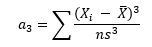
where n is the sample size, Xi is the ith X value, X is the average and s is the sample standard deviation. Note the exponent in the summation. It is “3”. The skewness is referred to as the “third standardized central moment for the probability model.”
Most software packages use a formula for the skewness that takes into account sample size:

This sample size formula is used here. It is also what Microsoft Excel uses. The difference between the two formula results becomes very small as the sample size increases.
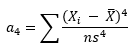
Figure 1 is a symmetrical data set. It was created by generating a set of data from 65 to 135 in steps of 5 with the number of each value as shown in Figure 1. For example, there are 3 65’s, 6 75’s, etc.
Figure 1: Symmetrical Dataset with Skewness = 0
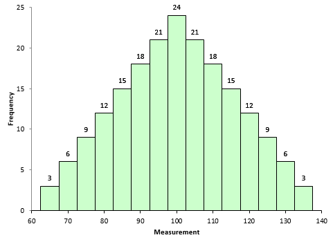
A truly symmetrical data set has a skewness equal to 0. It is easy to see why this is true from the skewness formula. Look at the term in the numerator after the summation sign. Each individual X value is subtracted from the average. So, if a set of data is truly symmetrical, for each point that is a distance “d” above the average, there will be a point that is a distance “-d” below the average.
Consider the value of 65 and value of 135. The average of the data in Figure 1 is 100. So, the following is true when X = 65:
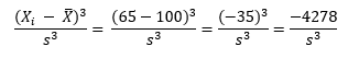
For X = 135, the following is true:
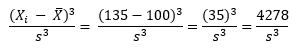
So, the -4278 and +4278 even out at 0. So, a truly symmetrical data set will have a skewness of 0.
To explore positive and negative values of skewness, let’s define the following term:
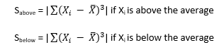
So, Sabove can be viewed as the “size” of the deviations from average when Xi is above the average. Likewise, Sbelow can be viewed as the “size” of the deviations from average when Xi is below the average. Then, skewness becomes the following:
If Sabove is larger than Sbelow, then skewness will be positive. This typically means that the right-hand tail will be longer than the left-hand tail. Figure 2 is an example of this. The skewness for this dataset is 0.514. A positive skewness indicates that the size of the right-handed tail is larger than the left-handed tail.
Figure 2: Dataset with Positive Skewness
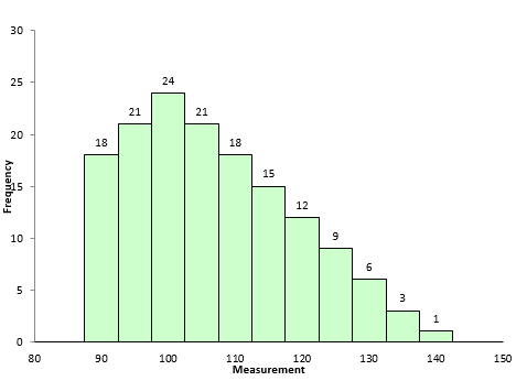
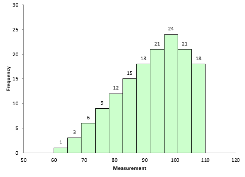
Figure 3 is an example of dataset with negative skewness. It is the mirror image essentially of Figure 2. The skewness is -0.514. In this case, Sbelow is larger than Sabove. The left-hand tail will typically be longer than the right-hand tail.
Figure 3: Dataset with Negative Skewness
So, when is the skewness too much? The rule of thumb seems to be:
- If the skewness is between -0.5 and 0.5, the data are fairly symmetrical
- If the skewness is between -1 and – 0.5 or between 0.5 and 1, the data are moderately skewed
- If the skewness is less than -1 or greater than 1, the data are highly skewed
KURTOSIS
How to define kurtosis? This is really the reason this article was updated. If you search for definitions of kurtosis, you will see some definitions that includes the word “peakedness” or other similar terms. For example,
- “Kurtosis is the degree of peakedness of a distribution” – Wolfram MathWorld
- “We use kurtosis as a measure of peakedness (or flatness)” – Real Statistics Using Excel
You can find other definitions that include peakedness or flatness when you search the web. The problem is these definitions are not correct. Dr. Peter Westfall published an article that addresses why kurtosis does not measure peakedness (link to article). He said:
“Kurtosis tells you virtually nothing about the shape of the peak – its only unambiguous interpretation is in terms of tail extremity.”
Dr. Westfall includes numerous examples of why you cannot relate the peakedness of the distribution to the kurtosis.
Dr. Donald Wheeler also discussed this in his two-part series on skewness and kurtosis. He said:
 “Kurtosis was originally thought to be a measure the “peakedness” of a distribution. However, since the central portion of the distribution is virtually ignored by this parameter, kurtosis cannot be said to measure peakedness directly. While there is a correlation between peakedness and kurtosis, the relationship is an indirect and imperfect one at best.”
Dr. Wheeler defines kurtosis as:
“The kurtosis parameter is a measure of the combined weight of the tails relative to the rest of the distribution.”
So, kurtosis is all about the tails of the distribution – not the peakedness or flatness. It measures the tail-heaviness of the distribution.
Kurtosis is defined as:
where n is the sample size, Xi is the ith X value, X is the average and s is the sample standard deviation. Note the exponent in the summation. It is “4”. The kurtosis is referred to as the “fourth standardized central moment for the probability model.”
Here is where is gets a little tricky. If you use the above equation, the kurtosis for a normal distribution is 3. Most software packages (including Microsoft Excel) use the formula below.
This formula does two things. It takes into account the sample size and it subtracts 3 from the kurtosis. With this equation, the kurtosis of a normal distribution is 0. This is really the excess kurtosis, but most software packages refer to it as simply kurtosis. The last equation is used here. So, if a dataset has a positive kurtosis, it has more in the tails than the normal distribution. If a dataset has a negative kurtosis, it has less in the tails than the normal distribution.
Since the exponent in the above is 4, the term in the summation will always be positive – regardless of whether Xi is above or below the average. Xi values close to the average contribute very little to the kurtosis. The tail values of Xi contribute much more to the kurtosis.
Look back at Figures 2 and 3. They are essentially mirror images of each other. The skewness of these datasets is different: 0.514 and -0.514. But the kurtosis is the same. Both have a kurtosis of -0.527. This is because kurtosis looks at the combined size of the tails.
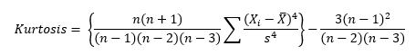
The kurtosis decreases as the tails become lighter. It increases as the tails become heavier. Figure 4 shows an extreme case. In this dataset, each value occurs 10 times. The values are 65 to 135 in increments of 5. The kurtosis of this dataset is -1.21. Since this value is less than 0, it is considered to be a “light-tailed” dataset. It has as much data in each tail as it does in the peak. Note that this is a symmetrical distribution, so the skewness is zero.
Figure 4: Negative Kurtosis Example
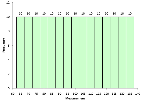
Figure 5 is shows a dataset with more weight in the tails. The kurtosis of this dataset is 1.86.
Figure 5: Positive Kurtosis Example
Most often, kurtosis is measured against the normal distribution. If the kurtosis is close to 0, then a normal distribution is often assumed. These are called mesokurtic distributions. If the kurtosis is less than zero, then the distribution is light tails and is called a platykurtic distribution. If the kurtosis is greater than zero, then the distribution has heavier tails and is called a leptokurtic distribution.
The problem with both skewness and kurtosis is the impact of sample size. This is described below.
OUR POPULATION
Are the skewness and kurtosis any value to you? You take a sample from your process and look at the calculated values for the skewness and kurtosis. What can you tell from these two results? To explore this, a data set of 5000 points was randomly generated. The goal was to have a mean of 100 and a standard deviation of 10. The random generation resulted in a data set with a mean of 99.95 and a standard deviation of 10.01. The histogram for these data is shown in Figure 6 and looks fairly bell-shaped.
Figure 6: Population Histogram
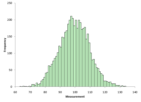
 The skewness of the data is 0.007. The kurtosis is 0.03. Both values are close to 0 as you would expect for a normal distribution. These two numbers represent the “true” value for the skewness and kurtosis since they were calculated from all the data. In real life, you don’t know the real skewness and kurtosis because you have to sample the process. This is where the problem begins for skewness and kurtosis. Sample size has a big impact on the results.
IMPACT OF SAMPLE SIZE ON SKEWNESS AND KURTOSIS
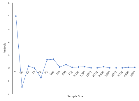
The 5,000-point dataset above was used to explore what happens to skewness and kurtosis based on sample size. For example, suppose we wanted to determine the skewness and kurtosis for a sample size of 5. 5 results were randomly selected from the data set above and the two statistics calculated. This was repeated for the sample sizes shown in Table 1.
Table 1: Impact of Sample Size on Skewness and Kurtosis
| Sample Size | Skewness | Kurtosis |
|---|---|---|
| 5 | 1.983 | 3.974 |
| 10 | -0.078 | -1.468 |
| 15 | -0.384 | 0.127 |
| 25 | -0.356 | -0.025 |
| 50 | -0.169 | -0.752 |
| 75 | -0.489 | 0.615 |
| 100 | -0.346 | 0.671 |
| 250 | 0.089 | 0.061 |
| 500 | 0.186 | 0.232 |
| 750 | -0.02 | 0.042 |
| 1000 | -0.138 | 0.062 |
| 1250 | 0.085 | 0.079 |
| 1500 | -0.017 | 0.001 |
| 2000 | -0.059 | -0.009 |
| 2500 | 0.037 | 0.096 |
| 3000 | 0.009 | 0.005 |
| 3500 | -0.015 | 0.004 |
| 4000 | -0.015 | -0.009 |
| 4500 | 0.009 | 0.036 |
| 5000 | 0.007 | 0.03 |
Notice how much different the results are when the sample size is small compared to the “true” skewness and kurtosis for the 5,000 results. For a sample size of 25, the skewness was -.356 compared to the true value of 0.007 while the kurtosis was -0.025. Both signs are opposite of the true values which would lead to wrong conclusions about the shape of the distribution. There appears to be a lot of variation in the results based on sample size.
Figure 7 shows how the skewness changes with sample size. Figure 8 is the same but for kurtosis.
Figure 7: Skewness versus Sample Size
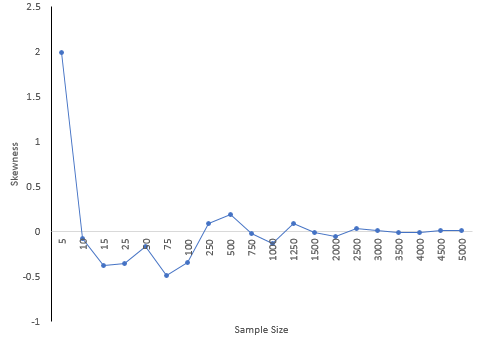
Figure 8: Kurtosis versus Sample Size
30 is a common number of samples used for process capability studies. A subgroup size of 30 was randomly selected from the data set. This was repeated 100 times. The skewness varied from -1.327 to 1.275 while the kurtosis varied from -1.12 to 2.978. What kind of decisions can you make about the shape of the distribution when the skewness and kurtosis vary so much? Essentially, no decisions.
CONCLUSIONS
The skewness and kurtosis statistics appear to be very dependent on the sample size. The table above shows the variation. In fact, even several hundred data points didn’t give very good estimates of the true kurtosis and skewness. Smaller sample sizes can give results that are very misleading. Dr Wheeler wrote in his book mentioned above:
“In short, skewness and kurtosis are practically worthless. Shewhart made this observation in his first book. The statistics for skewness and kurtosis simply do not provide any useful information beyond that already given by the measures of location and dispersion.”
Walter Shewhart was the “Father” of SPC. So, don’t put much emphasis on skewness and kurtosis values you may see. And remember, the more data you have, the better you can describe the shape of the distribution. But, in general, it appears there is little reason to pay much attention to skewness and kurtosis statistics. Just look at the histogram. It often gives you all the information you need.
To download the workbook containing the macro and results that generated the above tables, please click here.
Normal distribution
INTRODUCTION TO THE NORMAL DISTRIBUTION
If you search for “normal distribution” on Google, you will get a lot of hits. Wikipedia, the free encyclopedia, starts out its normal distribution with:
“In probability theory and statistics, the normal distribution or Gaussian distribution is a continuous probability distribution that describes data that clusters around a mean or average. The graph of the associated probability density function is bell-shaped, with a peak at the mean, and is known as the Gaussian function or bell curve.”
So, what does this mean to us and how do we use normal distributions? This month’s newsletter examines the normal distribution.
The normal distribution is shown below. It is shaped like a bell
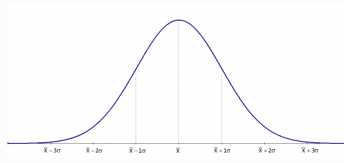
The normal distribution has several interesting characteristics:
- The shape of the distribution is determined by the average, μ (or X), and the standard deviation, σ.
- The highest point on the curve is the average.
- The distribution is symmetrical about the average.
- As you move away from the average, the points occur with less frequency.
- Most of the area under the curve (99.7%) lies between -3σ and +3σ of the average.
PROBABILITY DENSITY FUNCTION
The probability density function for the normal distribution is given by:
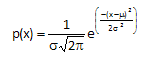
where x is some value between -∞ to +∞, μ is the average and σ is the standard deviation. The standard deviation is an indication of how wide the normal distribution is. The average gives the location of the normal distribution.
The distributions below show how the normal distribution changes as the standard deviation changes. The average is 100 and there are three different distributions with standard deviations of 5, 10, and 20. Note that the larger the standard deviation, the wider the distribution. When you are making a control chart, the range chart is actually monitoring the “width” of the distribution. The range chart answers the following question: is the spread in my data staying the same over time (in control) or is the spread getting smaller or larger (out of control)?
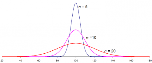
The distributions above were generated using Excel’s NORMSDIST function using an average of 100, one of the three standard deviations above and an X values range from 20 to 180. So, if you know your process average and process standard deviation, you can easily draw the normal distribution for your process. This, of course, assumes that your process is normally distributed.
STANDARD NORMAL DISTRIBUTION
For an average of 0 and a standard deviation of 1, the formula above becomes:
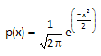
This is known as the standard normal distribution. For this distribution, the area under the curve from -∞ to +∞ is equal to 1.0. In addition, the area under the curve is proportional to the fraction of measurements that fall in that region. These two facts will be used to help determine the fraction of measurements that fall above some value (such as a specification limit), below some value, or between two values. The standard normal distribution is shown below.
HOW TO USE THE NORMAL DISTRIBUTION
Suppose you are interested in a certain quality characteristic, X. You have been monitoring this characteristic using an X-R chart. Both the X chart and the range chart are in statistical control. This means that you can predict what your process will make in the near future. You also know that you have good estimates of the process average (from the X chart) and the process standard deviation (from the range chart). Suppose that X = 100 and that σ = 10.
In addition, you have constructed a histogram for the last month’s data. The histogram is shown below.
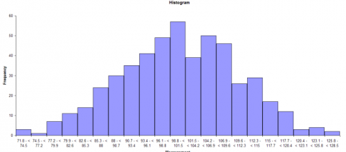
This histogram appears to be bell-shaped so you assume that you are dealing with a normal distribution. You can then draw the normal distribution for this process because you know the average and standard deviation (from your control charts). The normal distribution for this process is shown below.
A normal distribution has the following properties:
- 68% of the data is within +/- 1 standard deviation of the average
- 95% of the data is within +/- 2 standard deviations of the average
- 99.7% of the data is within +/- 3 standard deviations of the average
For your process, the following calculations can be done:
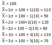
Thus, 68% of the data lies between 90 and 110; 95% of the data between 80 and 120; and 99.7% of the data between 70 and 130. The specifications for the process have been 65 to 140. Life is good - everything has been within specifications.
NORMAL DISTRIBUTION AND SPECIFICATIONS
Now suppose a customer has decided that the upper specification limit for your process should be 112. You can easily see from the histogram and the normal distribution that some of your product will be out of specification. The question is how much will be out of specification. This is where the z value becomes important. z is defined by the equation:

For our example, x = 112, so
z = (112-100)/10 = 12/10 = 1.2
z represents the number of standard deviations some value is away from the average. So, 112 is 1.2 standard deviations above the average. If z is negative, it means that the value is below the average.
To find out how much product is more than 1.2 standard deviations above the average, you can use what is called the “z table.” The z table gives the fraction of process output that is beyond some value x that is z standard deviations from the average. The z table is given below.
z Table: Standard Normal Distribution
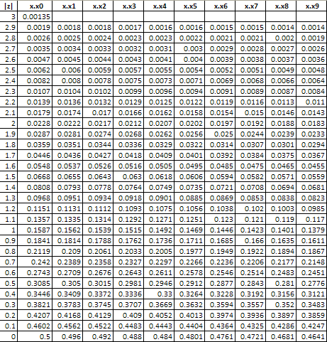
The table above returns a value of .1151 for a value of z = 1.2. This means that 11.51% of the data will be above the upper specification limit of 112. This is shown in the figure below. The area in red represents material that is out of specifications on the high side.
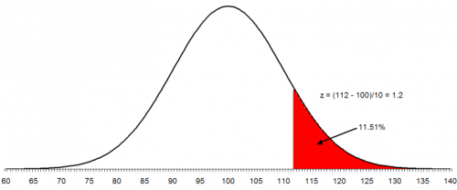
You can also use the NORMSDIST function in Excel to find the above result. This function in Excel returns the fraction of results less than a value. So, you must use 1 - NORMSDIST(z) if you want the fraction of data above z. In this example: 1- NORMSDIST(1.2) = .11507
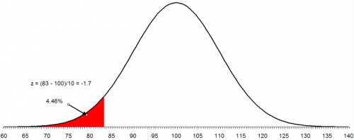
To make matters worse, the customer has now set the lower specification as 83. You want to find out what percent of the product will be out of specification on the low side. The process is the same as above. In this case:
z = (83 - 100)/10 = -17/10 = -1.7
This means that 83 is 1.7 standard deviations below the average. From the z tables, the fraction of data below 1.7 is 0.0446 or 4.46%. In Excel, NORMSDIST(-1.7) = 0.044565. The figure below shows this situation. The area in red represents the product that is below the lower specification limit.
To find out the area between two values, you use the fact that the area under the standard normal curve is 1. For example, suppose you want to find out the area between 83 and 112. We know that the area below 83 is .0446 and the area above 112 is .1151. Then the area between 83 and 112 is given by:
1 - .0446 - .1151 = 0.8403
Thus, 84.03% of the data lies between 83 and 112. Thus, with the new specifications, 84% of your product will be within specification. The remaining 16% will be out specification. And since the process is in statistical control, this will continue to be true until the process is changed fundamentally.
Histograms
There are a number of ways to determine if you have a normal distribution. One of the easiest is to construct a histogram based on the data. Simply examine the histogram and see if you think it is bell shaped. If you have lots of data, this is a perfectly valid way of determining if your data are normally distributed. Please see our December 2005 and January 2006 newsletters for more information on creating and using histograms.
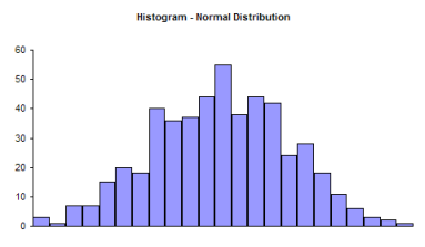
Note that a histogram of real data will not look like a perfect normal distribution. All you are trying to determine is if describing the data as a normal distribution is reasonable. For example, take a look at the histogram below. Does it look like a bell-shaped curve? Does it look normal? It is not perfect, but it appears that it is reasonable to assume that these data come from a normal distribution.
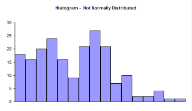
Now examine the histogram below. Does it look like a bell-shaped curve? This does not look bell-shaped. Most values tend toward zero. With these data, it is not reasonable to assume that there is a normal distribution present.
So, it is perfectly valid to use a histogram to determine it you think your data can be reasonably represented by a normal distribution. If you don’t have a lot of data, histograms will not be very useful in determining if you have a normal distribution. You can randomly take 20 samples from a normal distribution and the resulting histogram may not look normal. In these cases, you need to use the normal probability plot.
NORMAL PROBABILITY PLOTS
A normal probability plot can be used to determine if small sets of data come from a normal distribution. This involves using the probability properties of the normal distribution. We will eventually make a plot that we hope is linear. We will demonstrate the procedure using the data below.
Suppose we have ten samples from our process.
100, 98, 101, 93, 123, 112, 85, 76, 119, 111
We want to know if we can reasonably assume that these data come from a normal distribution. We can make a normal probability plot to help tell us this.
The steps below are used to make a normal probability plot of these data.
1. Sort the data in ascending order.
| Data | Sorted Data |
|---|---|
| 100 | 76 |
| 98 | 85 |
| 101 | 93 |
| 93 | 98 |
| 123 | 100 |
| 112 | 101 |
| 85 | 111 |
| 76 | 112 |
| 119 | 119 |
| 111 | 123 |
2. Number the sorted data from 1 to n where n is the number of samples (10 in this example).
| Data | Sorted Data | Number |
|---|---|---|
| 100 | 76 | 1 |
| 98 | 85 | 2 |
| 101 | 93 | 3 |
| 93 | 98 | 4 |
| 123 | 100 | 5 |
| 112 | 101 | 6 |
| 85 | 111 | 7 |
| 76 | 112 | 8 |
| 119 | 119 | 9 |
| 111 | 123 | 10 |
3. Calculate (i-0.5)/n for each value; this represents the cumulative probability.
| Data | Sorted Data | Number | Cumulative Probability |
|---|---|---|---|
| 100 | 76 | 1 | 0.05 |
| 98 | 85 | 2 | 0.15 |
| 101 | 93 | 3 | 0.25 |
| 93 | 98 | 4 | 0.35 |
| 123 | 100 | 5 | 0.45 |
| 112 | 101 | 6 | 0.55 |
| 85 | 111 | 7 | 0.65 |
| 76 | 112 | 8 | 0.75 |
| 119 | 119 | 9 | 0.85 |
| 111 | 123 | 10 | 0.95 |
4. Determine the z value from the standard normal distribution for each cumulative probability.
There are a number of ways to do this. The first cumulative probability value is 0.05. You can use the standard normal distribution table in last month’s newsletter to find the value of z corresponding to 0.05 probability. If you look at the table, you will see that z = -1.64 gives a cumulative probability of 0.0505 and a z = -1.65 gives a cumulative probability of 0.0495. So, the value of z that gives a cumulative probability of 0.05 is between -1.65 and -1.64.
The easiest way to do this is to use Excel’s NORMSINV function. For example, NORMSINV(0.05) = -1.64485. The rest of the values are shown in the table below.
| Data | Sorted Data | Number | Cumulative Probability | z Value |
|---|---|---|---|---|
| 100 | 76 | 1 | 0.05 | -1.64485 |
| 98 | 85 | 2 | 0.15 | -1.03643 |
| 101 | 93 | 3 | 0.25 | -0.67449 |
| 93 | 98 | 4 | 0.35 | -0.38532 |
| 123 | 100 | 5 | 0.45 | -0.12566 |
| 112 | 101 | 6 | 0.55 | 0.125661 |
| 85 | 111 | 7 | 0.65 | 0.385321 |
| 76 | 112 | 8 | 0.75 | 0.67449 |
| 119 | 119 | 9 | 0.85 | 1.036433 |
| 111 | 123 | 10 | 0.95 | 1.644853 |
5. Plot the sorted data versus the z values. The plot is shown below.
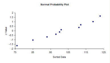
The question you want to ask yourself is “Do the points fall roughly in a straight line?” If they do, you can assume that you have a normal distribution. You can see from the chart above, the points appear to fall along a straight line.
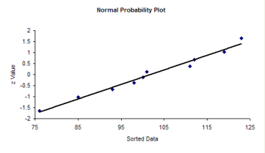
Since the data fall in a straight line, you can assume that you have a normal distribution.
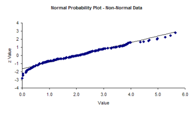
If the data do not fall in a straight line, then you cannot assume that you have a normal distribution. The normal probability plot for the non-normal histogram is shown below. Note that it tails like an S at one end. This is often typical of distributions that are not normal.
SUMMARY
There are two simple methods of determining if your data are normally distributed. If you have lots of data (100 points or more), you can use a histogram. If the histogram is somewhat bell-shaped, you can assume that you have a normal distribution. If you don’t have lots of data, construct a normal probability plot and see if the points fall roughly in a straight line. If they do, you can assume that your data are normally distributed.
5. Anderson-Darling Test for Normality
You have a set of data. You would like to know if it fits a certain distribution - for example, the normal distribution. Maybe there are a number of statistical tests you want to apply to the data but those tests assume your data are normally distributed? How can you determine if the data are normally distributed. You can construct a histogram and see if it looks like a normal distribution. You could also make a normal probability plot and see if the data falls in a straight line. We have past newsletters on histograms and making a normal probability plot. There is an additional test you can apply. It is called the Anderson-Darling test and is the subject of this month’s newsletter.
We have included an Excel workbook that you can download to perform the Anderson-Darling test for up to 200 data points. It includes a normal probability plot. We have also included a link to VBA function macro that you can use to calculate the Anderson-Darling statistic and associated p-value.
THE ANDERSON-DARLING TEST HYPOTHESES
The Anderson-Darling Test was developed in 1952 by Theodore Anderson and Donald Darling. It is a statistical test of whether or not a dataset comes from a certain probability distribution, e.g., the normal distribution. The test involves calculating the Anderson-Darling statistic. You can use the Anderson-Darling statistic to compare how well a data set fits different distributions.
The two hypotheses for the Anderson-Darling test for the normal distribution are given below:
H0: The data follows the normal distribution
H1: The data do not follow the normal distribution
The null hypothesis is that the data are normally distributed; the alternative hypothesis is that the data are non-normal.
In many cases (but not all), you can determine a p value for the Anderson-Darling statistic and use that value to help you determine if the test is significant are not. Remember the p (“probability”) value is the probability of getting a result that is more extreme if the null hypothesis is true. If the p value is low (e.g., <=0.05), you conclude that the data do not follow the normal distribution. Remember that you chose the significance level even though many people just use 0.05 the vast majority of the time. We will look at two different data sets and apply the Anderson-Darling test to both sets.
TWO DATA SETS
The first data set comes from Mater Mother’s Hospital in Brisbane, Australia. The data set contains the birth weight, gender, and time of birth of 44 babies born in the 24-hour period of 18 December 1997. The data were explained using four different distributions. We will focus on using the normal distribution, which was applied to the birth weights. The data are shown in the table below.
Table of Birth Weights (Grams)
| 3837 | 3480 |
|---|---|
| 3334 | 3116 |
| 3554 | 3428 |
| 3838 | 3783 |
| 3625 | 3345 |
| 2208 | 3034 |
| 1745 | 2184 |
| 2846 | 3300 |
| 3166 | 2383 |
| 3520 | 3428 |
| 3380 | 4162 |
| 3294 | 3630 |
| 2576 | 3406 |
| 3208 | 3402 |
| 3521 | 3500 |
| 3746 | 3736 |
| 3523 | 3370 |
| 2902 | 2121 |
| 2635 | 3150 |
| 3920 | 3866 |
| 3690 | 3542 |
| 3430 | 3278 |
The second set of data involves measuring the lengths of forearms in adult males. The 140 data values are in inches. The data is given in the table below.
Table of Forearm Lengths
| 17.3 | 20.9 | 18.7 | 17.9 | 18.3 |
|---|---|---|---|---|
| 19 | 18.1 | 18.8 | 19.1 | 17.9 |
| 18.2 | 19.4 | 19.4 | 17.3 | 18.3 |
| 19 | 20.5 | 18.5 | 19.4 | 19.6 |
| 19 | 20.4 | 18.6 | 18.3 | 19.6 |
| 20.4 | 16.1 | 19.6 | 19.3 | 21 |
| 18.3 | 18.7 | 18.5 | 17.2 | 18 |
| 19.9 | 18.8 | 20 | 17.5 | 17.9 |
| 18.7 | 17.3 | 17.8 | 19.6 | 18.1 |
| 20.9 | 18.1 | 19.8 | 17.6 | 19.5 |
| 17.7 | 19.9 | 16.6 | 20 | 17.1 |
| 19.1 | 19.6 | 19.4 | 19.9 | 18.9 |
| 19.7 | 18.4 | 19.3 | 16.9 | 18.5 |
| 18.1 | 19.5 | 20.1 | 19.5 | 19.2 |
| 18.4 | 16.8 | 20.5 | 20.4 | 20.5 |
| 17.5 | 17.1 | 20 | 19.1 | 18.3 |
| 18.9 | 18.9 | 20.8 | 18.5 | 19.4 |
| 19 | 19.7 | 17.7 | 18.3 | 21.4 |
| 20.5 | 19.7 | 19.9 | 19.8 | 19 |
| 17.3 | 19.2 | 18.8 | 19.1 | 18.6 |
| 18.3 | 20.6 | 16.4 | 17.5 | 19.5 |
| 18.4 | 20.1 | 18.5 | 18.5 | 17.4 |
| 18.6 | 18.8 | 19 | 19.3 | 18.5 |
| 19.8 | 17.1 | 20.6 | 19.1 | 18.4 |
| 20.2 | 18.6 | 19.2 | 17.4 | 18.3 |
| 18.5 | 18 | 17.1 | 16.3 | 20.7 |
| 18.5 | 18.7 | 16.3 | 18.2 | 19.3 |
| 18 | 20.3 | 17.2 | 18.8 | 17.7 |
THE ANDERSON-DARLING TEST
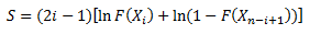
The Anderson-Darling Test will determine if a data set comes from a specified distribution, in our case, the normal distribution. The test makes use of the cumulative distribution function. The Anderson-Darling statistic is given by the following formula:
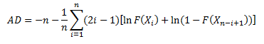
where n = sample size, F(X) = cumulative distribution function for the specified distribution and i = the ith sample when the data is sorted in ascending order. You will often see this statistic called A2.
To demonstrate the calculation using Microsoft Excel and to introduce the workbook, we will use the first five results from the baby weight data. Those five weights are 3837, 3334, 3554, 3838, and 3625 grams. You definitely want to have more data points than this to determine if your data are normally distributed. We will walk through the steps here. You can download the Excel workbook which will do this for you automatically here: download workbook. Of course, the Anderson-Darling test is included in the SPC for Excel software.
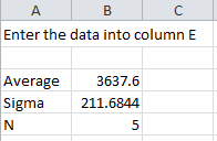
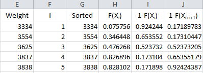
The data are placed in column E in the workbook. After entering the data, the workbook determines the average, standard deviation and number of data points present The workbook can handle up to 200 data points.
The next step is to number the data from 1 to n as shown below.
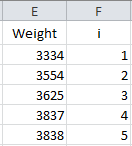
The formula in Cell F2 is “=IF(ISBLANK(E2),”“,1)”. The formula in cell F3 is “=IF(ISBLANK(E3),”“,F2+1)”. The formula in cell F3 is copied down the column.
To calculate the Anderson-Darling statistic, you need to sort the data in ascending order. This is done in column G using the Excel function SMALL(array, k). This function returns the kth smallest number in the array. The sorted data are placed in column G.
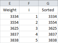
The formula in cell G2 is “=IF(ISBLANK(E2), NA(),SMALL(E$2:E$201,F2))”. This formula is copied down the column. The NA() is used so that Excel will not plot points with no data.
Now we are ready to calculate F(Xi). Remember, this is the cumulative distribution function. In Excel, you can determine this using either the NORMDIST or NORMSDIST functions. They both will give the same result. We will use the NORMDIST function. The workbook places these results in column H.
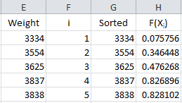
The formula in cell H2 is “=IF(ISBLANK(E2),”“,NORMDIST(G2, $B$3, $B$4, TRUE))”. This formula is copied down column H. The average is in cell B3; the standard deviation in cell B4. Using “TRUE” returns the cumulative distribution function.
Take a look again at the Anderson-Darling statistic equation:
We have F(Xi). The equation shows we need 1-F(Xn-i+1). It takes two steps to get this in the workbook. First the value of 1- F(Xi) is calculated in column I and then the results are sorted in column J. The results are shown below.
The formula in cells I2 is “=IF(ISBLANK(E2), “”, 1-H2)” and the formula in cell J2 is “=IF(ISBLANK(E2),”“,SMALL(I$2:I$201,F2)).” These are copied down those two columns.
We are now ready to calculate the summation portion of the equation. So, define the following for the summation term in the Anderson-Darling equation:
This result is placed in column K in the workbook.
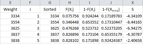
The formula in cell K2 is “=IF(ISBLANK(E2),””,(2F2-1)(LN(H2)+LN(J2)))”. This formula is copied down the column.
We are now ready to calculate the Anderson-Darling statistic. This is given by:
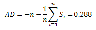
The value of AD needs to be adjusted for small sample sizes. The adjusted AD value is given by:
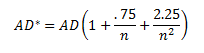
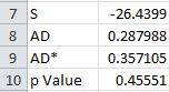
For these 5 data points, AD* = .357. The workbook has the following output in columns A and B:
The last entry is the p value. That depends on the value of AD*.
THE P VALUE FOR THE ADJUSTED ANDERSON-DARLING STATISTIC
The calculation of the p value is not straightforward. The reference most people use is R.B. D’Augostino and M.A. Stephens, Eds., 1986, Goodness-of-Fit Techniques, Marcel Dekker. There are different equations depending on the value of AD*. These are given by:
- If AD=>0.6, then p = exp(1.2937 - 5.709(AD)+ 0.0186(AD*)2
- If 0.34 < AD* < .6, then p = exp(0.9177 - 4.279(AD) - 1.38(AD)2
- If 0.2 < AD* < 0.34, then p = 1 - exp(-8.318 + 42.796(AD)- 59.938(AD)2)
- If AD* <= 0.2, then p = 1 - exp(-13.436 + 101.14(AD)- 223.73(AD)2)
The workbook (and the SPC for Excel software) uses these equations to determine the p value for the Anderson-Darling statistic.
APPLYING THE ANDERSON-DARLING TEST
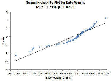
Now let’s apply the test to the two sets of data, starting with the baby weight. The question we are asking is - are the baby weight data normally distributed?” The results for that set of data are given below.
AD = 1.717 AD* = 1.748 p Value = 0.000179
The p value is less than 0.05. Since the p value is low, we reject the null hypotheses that the data are from a normal distribution. You can construct a normal probability plot of the data. How to do this is explained in our June 2009 newsletter. The normal probability plot is included in the workbook. If the data comes from a normal distribution, the points should fall in a fairly straight line. You can see that this is not the case for these data and confirms that the data does not come from a normal distribution.
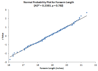
Now consider the forearm length data. Again, we are asking the question - are the data normally distributed? The results for the elbow lengths
AD = 0.237 AD* = 0.238 p Value = 0.782045
Since the p value is large, we accept the null hypotheses that the data are from a normal distribution. The normal probability plot shown below confirms this.
The workbook contains all you need to do the Anderson-Darling test and to see the normal probability plot. If you prefer to use VBA code, this link gives you the VBA code for an Anderson-Darling function. You can copy this code into a workbook and use it to calculate AD, AD* and the p value for the data.
SUMMARY
The Anderson-Darling test is used to determine if a data set follows a specified distribution. In this newsletter, we applied this test to the normal distribution. The test involves calculating the Anderson-Darling statistic and then determining the p value for the statistic. It is often used with the normal probability plot.
Hypothesis Testing
What is a hypothesis? According to the Merriam-Webster’s on-line dictionary, a hypothesis is an idea or theory that is not proven but that leads to further study or discussion. There are many examples of hypothesis. For example, people who get flu shots are less likely to get the flu. Or just the opposite hypothesis: getting a flu shot makes no difference in whether someone gets the flu.
So, a hypothesis is just a statement of theory. It may or may not be true. A drug company can claim that a new drug is better at decreasing blood pressure. You may claim that the diet plan you created helps people lose more weight than a nationally known diet plan. All these things are just statements – just hypotheses.
The hypothesis is the starting point. From there, we have to test the hypothesis and reach a decision if the hypothesis is probably true or probably false. Note the word “probably.” There is always variation – so there is always a chance for you to make the wrong decision. This month’s publication takes a look at the five steps involved in conducting a hypothesis test.
THE PROBLEM
A lean six sigma project team is recommending a change in the coating process you are in charge of to help reduce costs. The key variable in your process is the thickness of the coating.
The average coating thickness is 5 mil. You want to be sure that the coating thickness remains the same before you will approve the process change.
The team wants to perform a hypothesis test to prove that the average coating thickness will not change. The team will go through the basic five steps of hypothesis testing:
- Formulate the null hypothesis and the alternative hypothesis
- Determine the significance level
- Collect the data and calculate the sample statistics
- Calculate the p value for the hypothesis test
- Compare the p value to the desired significance level
The details of the five steps are shown below. However, before those steps are covered, a review of the standard normal distribution is needed. This will be required when we do some calculations.
A BRIEF PAUSE FOR THE STANDARD NORMAL DISTRIBUTION
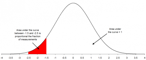
We need to digress a moment here because we will need to make use of a special case of the normal distribution – when the average = 0 and the standard deviation = 1. This special case is called the standard normal distribution and is shown in Figure 1.
Figure 1: Standard Normal Distribution
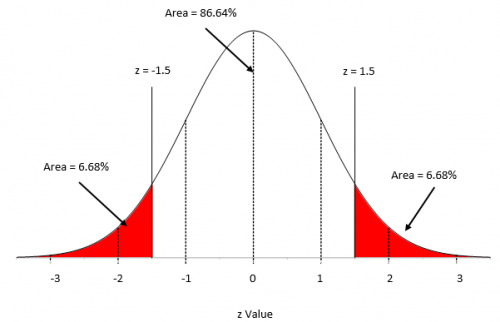
For this distribution, the area under the curve from -∞ to +∞ is equal to 1.0. In addition, the area under the curve is proportional to the fraction of measurements that fall in that region. These two facts can used to help determine the fraction of measurements that fall above some value (such as a specification limit), below some value, or between two values.
 The x axis in Figure 1 has “z” values. Any normal distribution can be converted to the standard normal distribution by using the following to calculate z:
z= (x- μ)/σ
where x is some value, μ is the average, and σ is the standard deviation of the x values. The value of z (the z score) is simply how many standard deviations a value, x, is from the average.
For example, suppose x is 1.5 standard deviations below the average. In this case, z = -1.5. The area below z = -1.5 is the percentage of x values that are more than 1.5 standard deviations below the average. For z = -1.5, that area is 6.68% as is shown in Figure 1. If z = 1.5, then the area above z = 1.5 is the percentage of x values that are more than 1.5 standard deviations above the average. This area is also 6.68%.
To find the percentage of data within z = -1.5 and z = 1.5, you simply use the fact that the area under the curve is 100%, so the percentage of data between the two z values is 100 – 6.68 – 6.68 = 86.64%. You can determine these percentages from a table of z values (see our publication on the normal distribution) or by using Excel’s NORMSDIST function.
These percentages can also be viewed as probabilities, e.g., the probability of getting a result that is less than -1.5 standard deviations below the average is 0.0668. We will make use of this knowledge below. Now back to the steps in hypothesis testing.
STEP 1: FORMULATE THE NULL HYPOTHESIS AND ALTERNATIVE HYPOTHESIS
 You probably have heard of the null hypothesis and alternative hypothesis. We will start with the null hypothesis, which is denoted by H0. Remember, you want to investigate if the process change will impact the average coating thickness. The null hypothesis is set up to assume that nothing changes – that the status quo holds – or in this case, the process change will not impact the average coating thickness.
So the null hypothesis (H0) is that the process change will not impact the average coating thickness; the average coating thickness (μ) will remain at 5. This is usually written as:
H0 = 5
Now for the alternative hypothesis, which is denoted by H1. The alternative hypothesis is that the process change will have an effect on the average coating thickness and the average coating thickness will not equal 5. This is usually written as:
H1 ≠ 5
This is called a two-sided hypothesis test since you are only interested if the mean is not equal to 5. You can have one-sided tests where you want the mean to be greater than or less than some value.
STEP 2: DETERMINE THE SIGNIFICANCE LEVEL YOU WANT
The significance level is important in hypothesis testing. It is the probability of rejecting the null hypothesis when it is true. This probability is denoted by α. Typical values of α include 0.05 and 0.01. You decide that you want α to be 0.05. This means that there is only a 5% of chance of rejecting the null hypothesis when it is actually true.
STEP 3: COLLECT THE DATA AND CALCULATE THE SAMPLE STATISTICS
The process change is made and data are collected. The team recommended collecting 25 samples over time. (Note: The choice of sample size is very important. This will be subject of next month’s publication.) The average coating thickness was measured for each sample. The following statistics were then calculated:
X = average coating thickness = 5.06
s = standard deviation of the coating thickness = 0.20
We have our statistics. How do you decide to accept or reject the null hypothesis? The way you do this is to assume that the null hypothesis is true and then determine the probability (p value) of getting this sample average. If the p value is large, it means that there is large probability of getting an average thickness of 5.06 with a standard deviation of 0.20 when the null hypothesis is true and you will accept that the null hypothesis is probably true. But if the probability of getting these statistics is small, you will assume that the null hypothesis is probably not true and reject it in favor the alternative hypothesis.
STEP 4: CALCULATE THE P VALUE
To determine this probability, you will need to consider your sampling distribution. The distribution of sample averages tends to be normal when the sample size is large enough. We will use this assumption here. So, your sampling distribution is represented by all the possible sample averages of sample size 25 from the population of coating thicknesses. This normal distribution is shown in Figure 2.
Figure 2: Normal Distribution for Sample Averages
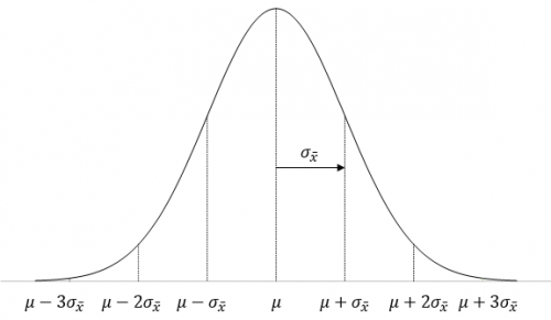
The highest point on the curve is the average. The population average of the sample averages (μX ) is equal to the population average, μ, so we have just used μ in Figure 1. The standard deviation of the sample averages is denoted by σX.
To be able to draw your sampling distribution, you need to know μX and σX. Since you assumed that the null hypothesis is true, μX = 5.0. The standard deviation of the sample averages is given by:
σX =σ/√n
where σ is the population standard deviation and n is the sample size.
You don’t know what the population standard deviation is, but you have an estimate from the sample statistics. The standard deviation of the 25 samples was 0.2. You can use this as the population standard deviation.
σX =σ/√n = s/√n=0.2/√25=0.04
Now you can draw the sampling distribution and add the sample average as shown in Figure 3.
Figure 3: Sampling Distribution
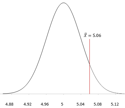
You want to know what the probability of getting X = 5.06 is with this sampling distribution. You can view this probability as how far from μ the sample average is. The further away it is, the smaller the probability of getting X = 5.06 with this sampling distribution.
Now we return to the z score. Remember, the z score is a measure of how many standard deviations the sample average (X )is from the population average (μ). For this example, the z value is calculated as:
z= (X-μ)/σX =(5.06-5)/.04=.06/.04=1.5
So, 5.06 is 1.5 standard deviations away from the average. As shown above, the probability of getting a result that is 1.5 standard deviations away from the average is 0.0668. Remember, this a two-side test, so you didn’t care if the difference was above or below the average. So, the probability of getting an average that is more than 1.5 standard deviations away from the average is 2(0.0668) = 0.1336 or 13.36%. This is the p value:
p value = 0.1336
Remember what the p value represents. You assumed that the null hypothesis is true. The p value is the probability of getting this result (or a more extreme result) if the null hypothesis is true.
STEP 5: COMPARE THE P VALUE TO THE DESIRED SIGNIFICANCE LEVEL
In step 2, we set the significance level at 0.05. Since our p value is greater than this, we conclude that the coating thickness was not impacted by the process change. We accept the null hypothesis as probably being true. If the p value had been less than 0.05, we would rejected the null hypothesis and said that the process change did impact the coating thickness.
SUMMARY
This newsletter has taken a look at how to perform hypothesis testing. The five steps are:
- Formulate the null hypothesis and the alternative hypothesis
- Determine the significance level you want
- Collect the data and calculate the sample statistics
- Calculate the p value for the hypothesis test
- Compare the p value to the desired significance level
The normal distribution was used to demonstrate how hypothesis testing is done. You will not always be dealing with the normal distribution but the process is essentially the same. One item that is still to be discussed is how to select the sample size. This will be the subject of a later publication.